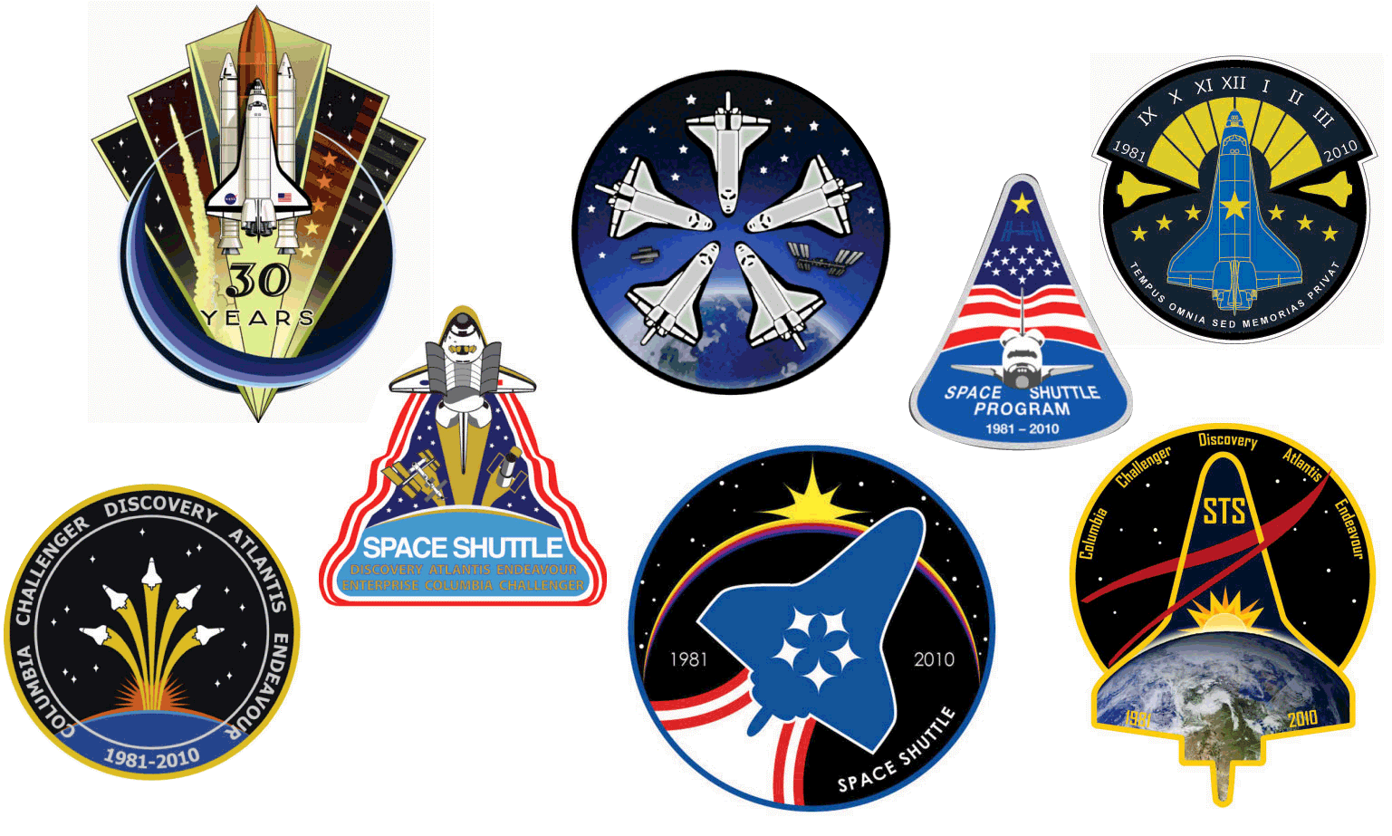
Patch designs submitted by Space Center employees have been posted on the Collect Space website. I decided to critique them from a design aspect... a little emotional content is thrown in for good measure. Did your entry make my list of comments???
The below comments are without reading any of the artist's intent - just solely on graphical interpretation. In order of presentation on CollectSpace site, not preference...
Interesting overall design element. Read the words on this one... Earth shown because shuttle was bound by low earth orbit - did Wayne Hale design this one? ;)
http://www.collectspace.com/images/sscp/sscp04.html
Strong graphics
http://www.collectspace.com/images/sscp/sscp10.html
Dawn to Dusk interesting concept, although somewhat limiting to end the shuttle in darkness instead of the stepping stone low earth orbit really is. However, some may seem that fitting... (see bound to earth comments above)
http://www.collectspace.com/images/sscp/sscp15.html
Several very familiar patch elements (especially STS-8), looks like an old DOD patch minus a flag.
http://www.collectspace.com/images/sscp/sscp16.html
I would really, really like to meet the person that has this image of the shuttle program...
http://www.collectspace.com/images/sscp/sscp18.html
God bless those who are not so artistically gifted... I appreciate their desire!
http://www.collectspace.com/images/sscp/sscp20.html
Shuttle paths are cool - although I grow so tiresome of the Astronaut symbol on every damn patch. However, ISS orbit finishing the design does not really work with the earth below on teh patch.
http://www.collectspace.com/images/sscp/sscp23.html
Love the "reflecting" idea! Probably was most moved by this entry.
http://www.collectspace.com/images/sscp/sscp26.html
Good, clean design (and I have always loved that view of the orbiter).
http://www.collectspace.com/images/sscp/sscp29.html
Like the idea of the paths creating "feathers" - looks like a PHALCON designed it.
http://www.collectspace.com/images/sscp/sscp31.html
There are elements I really like about this one. But would want 1981-2010 type dates on there. Love the inclusion of a star for every flight.
http://www.collectspace.com/images/sscp/sscp35.html
Not sure what it is that intrigues me on this one... has merit!
http://www.collectspace.com/images/sscp/sscp36.html
Whoa... completely out of the box. Innovative, good design, not sure about the colors.
http://www.collectspace.com/images/sscp/sscp37.html
Interesting, like the shuttles being differentiated.
http://www.collectspace.com/images/sscp/sscp40.html
Clean - would def do something differentwith the numbers though.
http://www.collectspace.com/images/sscp/sscp41.html
Kind of sad, riding away - gonna be a rough goodbye!
http://www.collectspace.com/images/sscp/sscp42.html
Nice design, flat out! Add some dates.
http://www.collectspace.com/images/sscp/sscp44.html
Another shout-out to those less artisticly gifted but care enough about the shuttle to put their idea out there! (Of course, I had to read this description to understand why there was no image file.)
http://www.collectspace.com/images/sscp/sscp45.html
Very original! I feel like a shuttle timeliner cam eup with this idea....
http://www.collectspace.com/images/sscp/sscp47.html
Really, really nice. Think I would have to represent the earth graphically though. A consistent element with almost every patch from the shuttle era - the overall patch should represent the genral feel of all.
http://www.collectspace.com/images/sscp/sscp51.html
Clean graphics, appreciate the orbiter floating at an angle - maybe a little to simple and subtle for me though.
http://www.collectspace.com/images/sscp/sscp53.html
Calling this one out because it has Mir on it (probably my all-time favorite program to work on thus far). Might be nice in color - and I like the hand-lettered look, actually. Need to add a micro-gravity M if you keep the little nebula above Hubble.
http://www.collectspace.com/images/sscp/sscp54.html
Again, very symbolic of an ending. Pretty sure the Space shuttle has never been depicted this way on a patch.
http://www.collectspace.com/images/sscp/sscp55.html
I really like the white vs. orange ET - shows we learn as we go. And I like the steam plume at the bottom of the patch. Stars around Hubble and ISS need balancing. Interesting how many people used Hubble to symbolize all other not ISS.
http://www.collectspace.com/images/sscp/sscp57.html
Neat view, needs words and stars!
http://www.collectspace.com/images/sscp/sscp59.html
Lot of good elements here, except I can not tell what the two presumably science symbols are. And I like the differentiation between orbiters, a record of those lost.
http://www.collectspace.com/images/sscp/sscp60.html
Like the graphics and I like the EVA guy in there - HUGE part of the program to not overlook. Plus, that image of Bruce is iconic!
http://www.collectspace.com/images/sscp/sscp61.html
I am now realizing there have been many more images added to the gallery.....
Hmmm.... I like this. I particularly like the two orbiters at the bottom. Would be interesting to see in color.
http://www.collectspace.com/images/sscp/sscp62.html
Neat idea... but not a patch. Keep going!
http://www.collectspace.com/images/sscp/sscp67.html
I like this odd little job too. Even with the hypercycloids instead of stars!
http://www.collectspace.com/images/sscp/sscp68.html
Interesting... looks more like a Challenger Center logo though. Several of these are made by the same guy/gal.
http://www.collectspace.com/images/sscp/sscp74.html
Clean, in memorium look. Tears....
http://www.collectspace.com/images/sscp/sscp79.html
I realize this one is more of an STS-133 entry. We have NEVER had a square/rectangular shuttle flight patch. Had to look at # of stars significance. I would like to see a star for every mission in the border (or dividing the border from the patch as I have seen in some entries). Starting to wonder how American we CAN go with all the International participants that flew - but there should def be a dominance. The shuttle is our muscle, after all! ;)
http://www.collectspace.com/images/sscp/sscp80.html
More tears..... star trail # of missions is a neat idea.
http://www.collectspace.com/images/sscp/sscp81.html
This entrant must be from Arizona...
http://www.collectspace.com/images/sscp/sscp84.html
Service dates on the shuttles is an interesting thought. As long as we make the two lost gold... like the others I mentioned ;)
http://www.collectspace.com/images/sscp/sscp85.html
Just lots and lots of intriguing elements on this one!
http://www.collectspace.com/images/sscp/sscp86.html


No comments:
Post a Comment